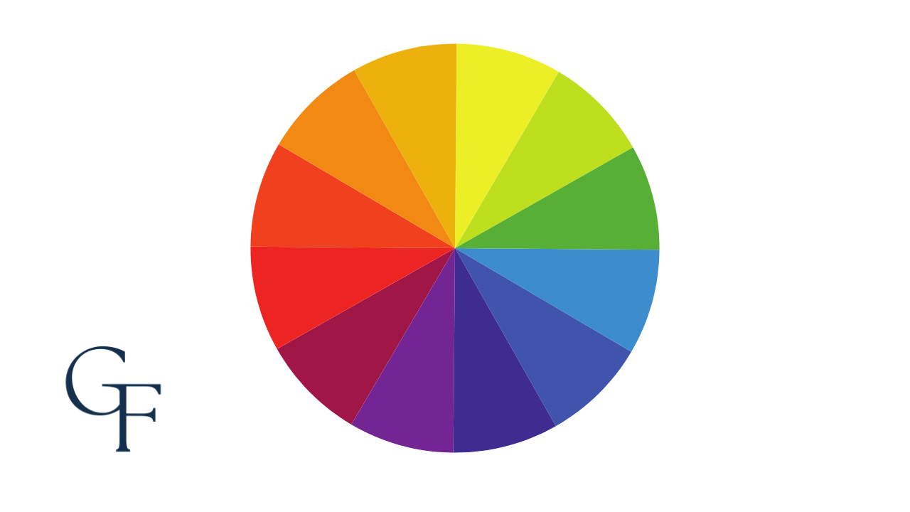
An important aspect of men's attire is the color combinations of our outfits and how each piece interacts with the others. While the fit of our clothes is crucial, understanding colors is a more nuanced matter.
This article aims to guide you through the fundamentals of understanding the significance of color theory in relation to style.
Understanding the Color Wheel
The color wheel is a circular representation of numerous colors, with twelve colors evenly spaced around it. It is a fundamental concept in fashion and style, as it helps us to create harmonious color combinations for both clothing and accessories. Understanding the color wheel can give us the tools to create a perfectly balanced and classy-looking ensemble. The color wheel is divided into primary, secondary, and tertiary colors, which form the basis of color theory.
Sir Isaac Newton created this instrument in the 17th century for scientific purposes, originally to study the refraction of light. Its application has since expanded to include design, art, and fashion.
Primary Colors
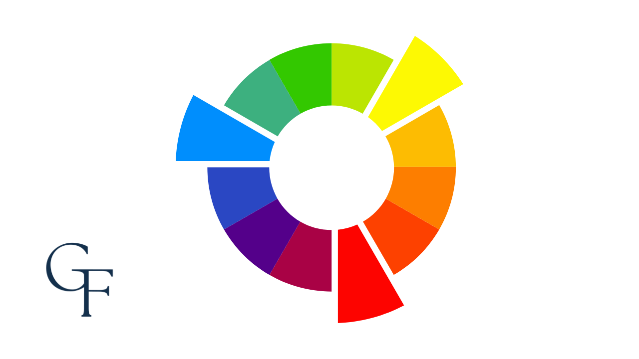
Primary colors are considered the basis from which all other colors originate. All additional colors that we know of are mixed from primary colors. As a result, we cannot mix any other colors to form the three primary colors; they simply are what they are.
Secondary Colors
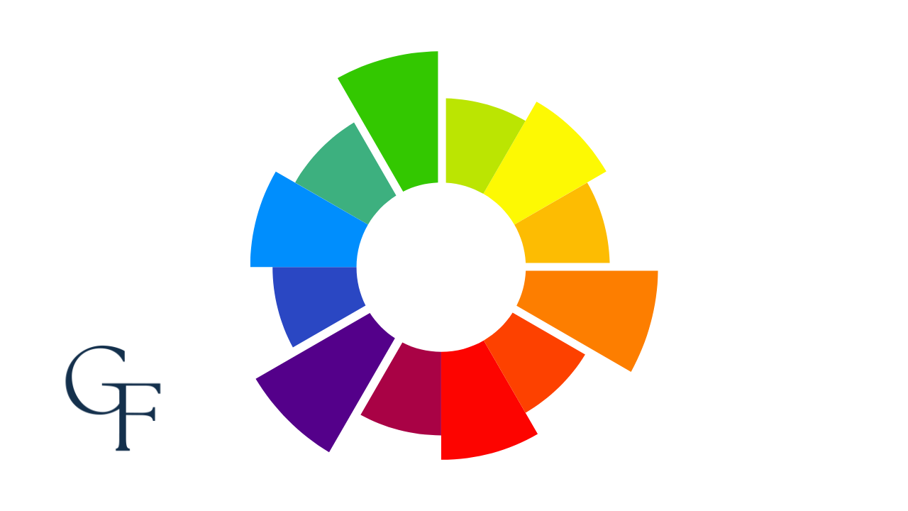
Secondary colors are created by mixing two primary colors. For example, yellow and blue combine to form green. These colors appear between the primary colors on the color wheel.
Tertiary Colors
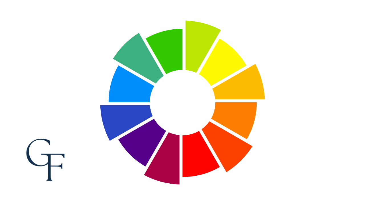
The colors between the primary and secondary colors on the color wheel are called tertiary colors. These colors are created by mixing a primary color with a secondary color. For example, when you mix red with purple, you get the tertiary color magenta.
We have previously depicted the color wheel as consisting of twelve distinct colors; however, it's essential to recognize that this representation oversimplifies the full range of achievable colors.

What About Black & White?
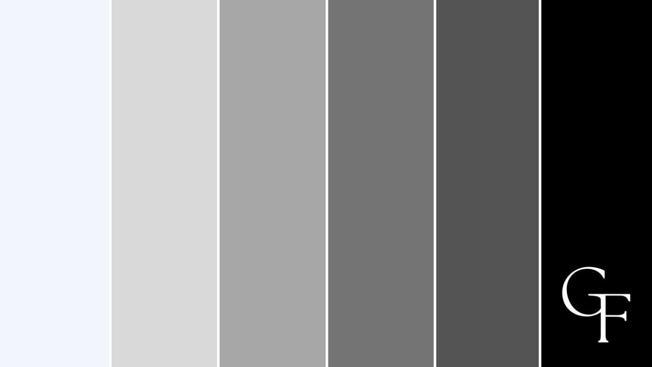
You may have noticed that black and white are excluded from the color wheel. This is because they are not technically considered colors; instead, they are found on a different scale known as the grayscale. By mixing varying amounts of black and white, you can create a wide variety of shades and tints (more on these terms later).
Important Terminology
Let's continue with our exploration of the twelve colors on the color wheel by delving into some key terms that are crucial for understanding the four essential color qualities.
Hue
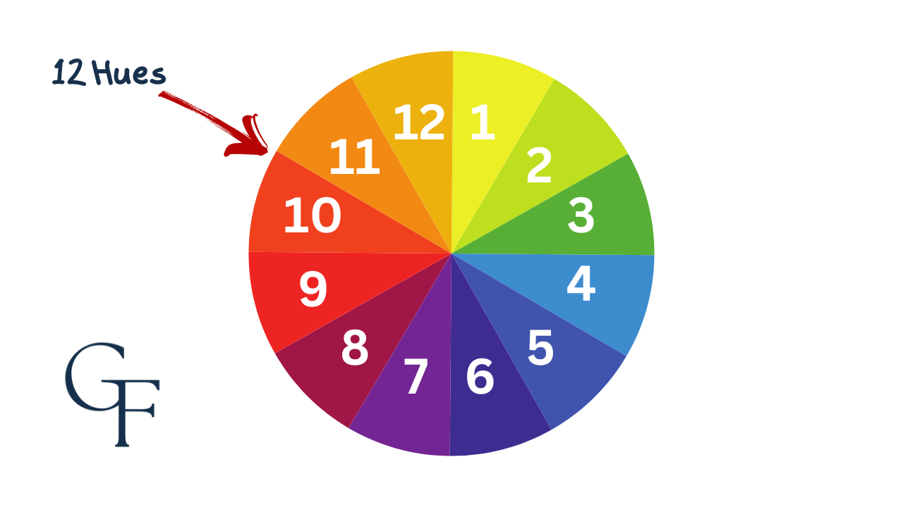
Hue can be a lot more confusing than it is; it is just color in and of itself. For example, our standard twelve-color wheel (depicted below) has twelve hues.
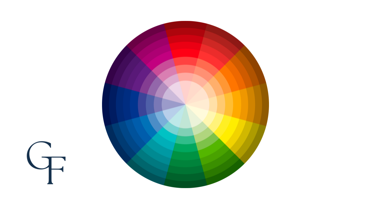
And even if we were to look at the more complex version of this same wheel (shown below) and pick a random, single color from it, whatever that color is would also be its hue.

Don't overthink it; a hue is simply a single color on the color wheel's spectrum. For instance, the hue of blue is blue, and the hue of magenta is magenta.
Value (a. k. a. Tint & Shade)
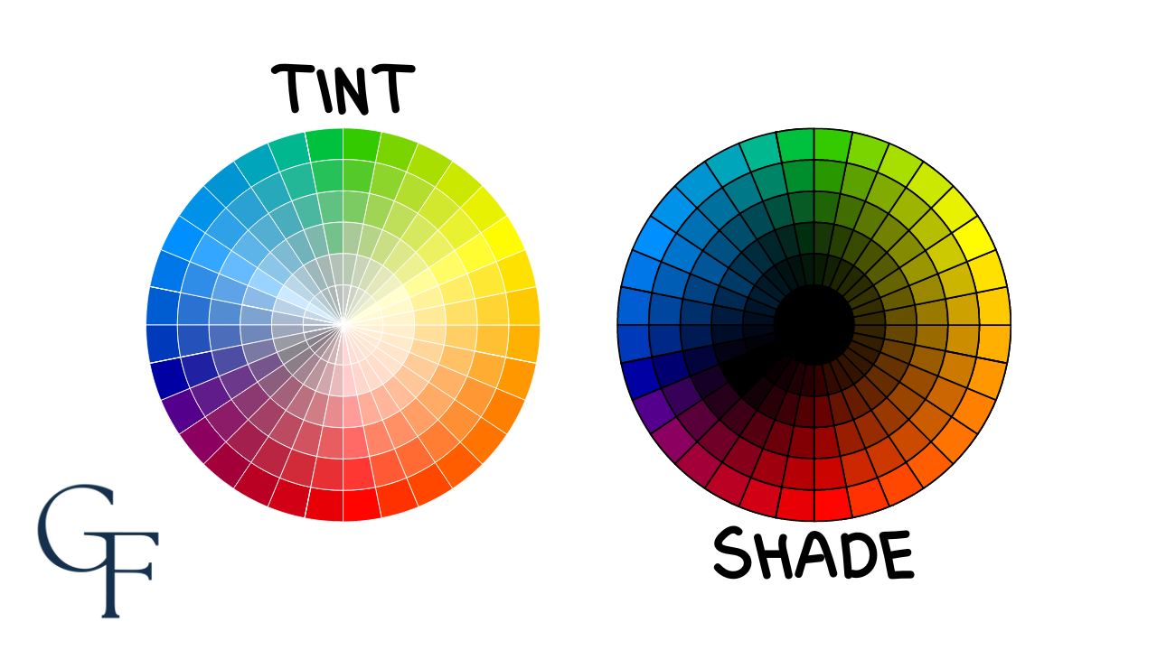
When white is added to any color, it becomes a lighter tint and less intense. Similarly, adding black to any color produces a darker shade and a less intense (darker) hue. This difference in lightness and darkness is referred to as a color's value. Mixing gray with any color results in a tone.
Saturation
We've established that tints, shades, and tones are less intense than their respective color hues. Again, hues are considered the "true colors" on the color wheel, and black, white, and gray are not located on the wheel at all. Therefore, they must be added separately to create tints, shades, and tones.
This level of intensity is called a color's saturation. A color is desaturated if it appears dull and grayed out, and more saturated if it appears brighter.

Temperature
Color temperature is the perceived warmth of a color. Red and yellow are considered warm, while blue is considered cool. The warmth of each color can vary as we move around the color wheel.
For instance, a warmer red would contain more yellow, while a cooler red would contain more blue (see below):
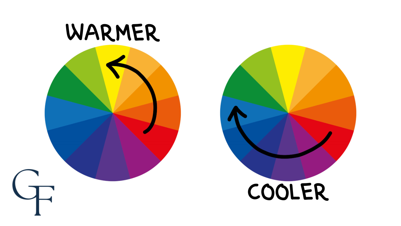
The results of mixing warm and cool colors can vary. For instance, green, which is a combination of blue and yellow, is considered a cool color, while purple, a combination of red and blue, is thought of as a warm color. It's important to note that all colors can appear warmer or cooler depending on how much red, yellow, or blue they contain.
Even More Possibilities
When we combine hue, value, saturation, and temperature, the results yield numerous possible color combinations within our standard twelve-color wheel. The resultant effect looks something like this:
Palette Creations
We've now introduced the color wheel and explained key terminology.
Now, we can explore how it serves as a tool for dressing well. Let's showcase how we utilize this tool to create color combinations that work well together. To do this, we will need to introduce a few more terms in relation to the wheel itself.
Monochromatic Palette
This straightforward palette option takes a single color from the wheel and applies tints, shades, and tones to create different possibilities.
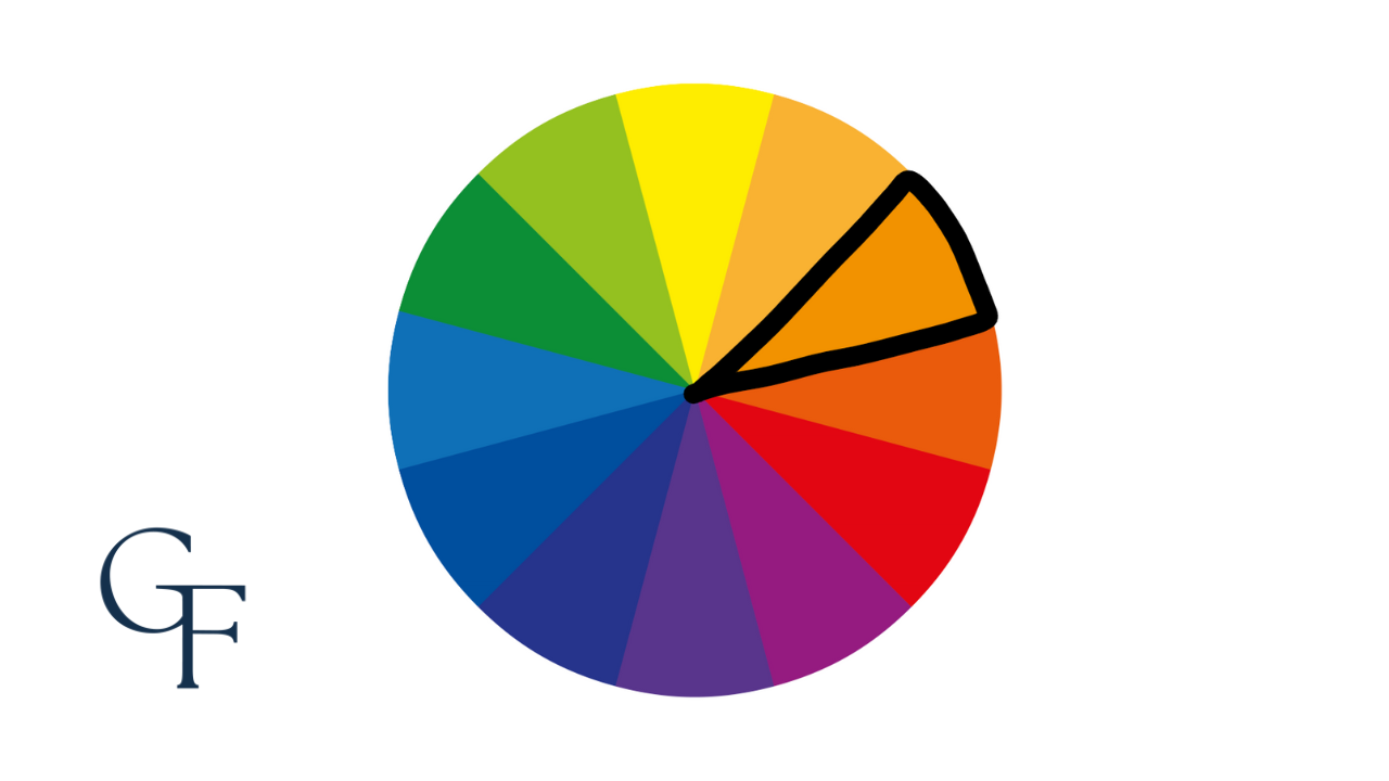
Complementary Palette
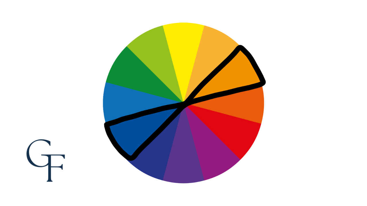
Complementary colors are located directly across from one another on the color wheel and have the most contrast because of their distance from each other. These colors look great when paired together and work well to provide balance when putting together different outfits.
Split-Complementary Palette
Similar to complementary colors, this palette begins with a single color from the wheel and its two direct analogues, which are the complements of that color.
Confused? Here's an example...
Red-orange and yellow-orange are the split complements of the primary color blue (see below).
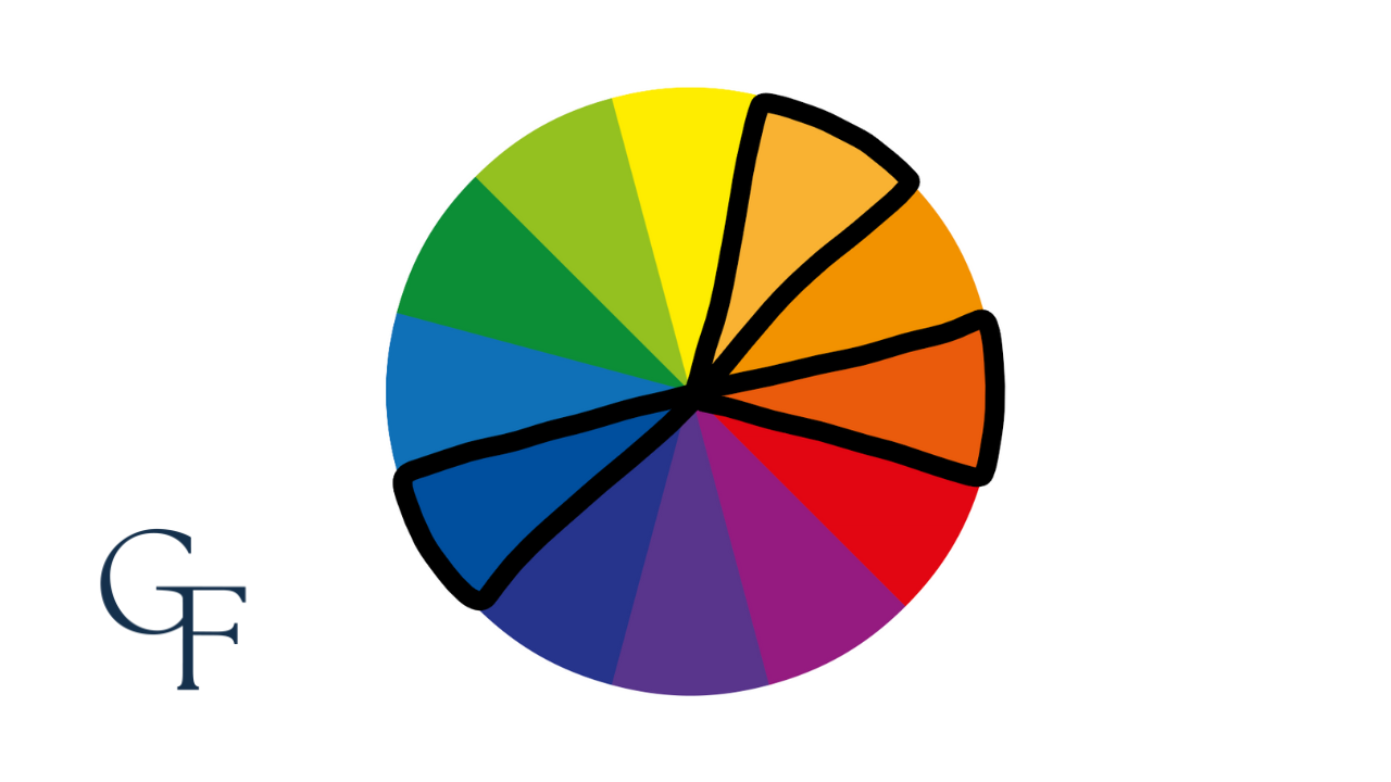
Split-complementary colors offer the same contrast level as complementary colors, but provide a greater variety.
Analogous Palette
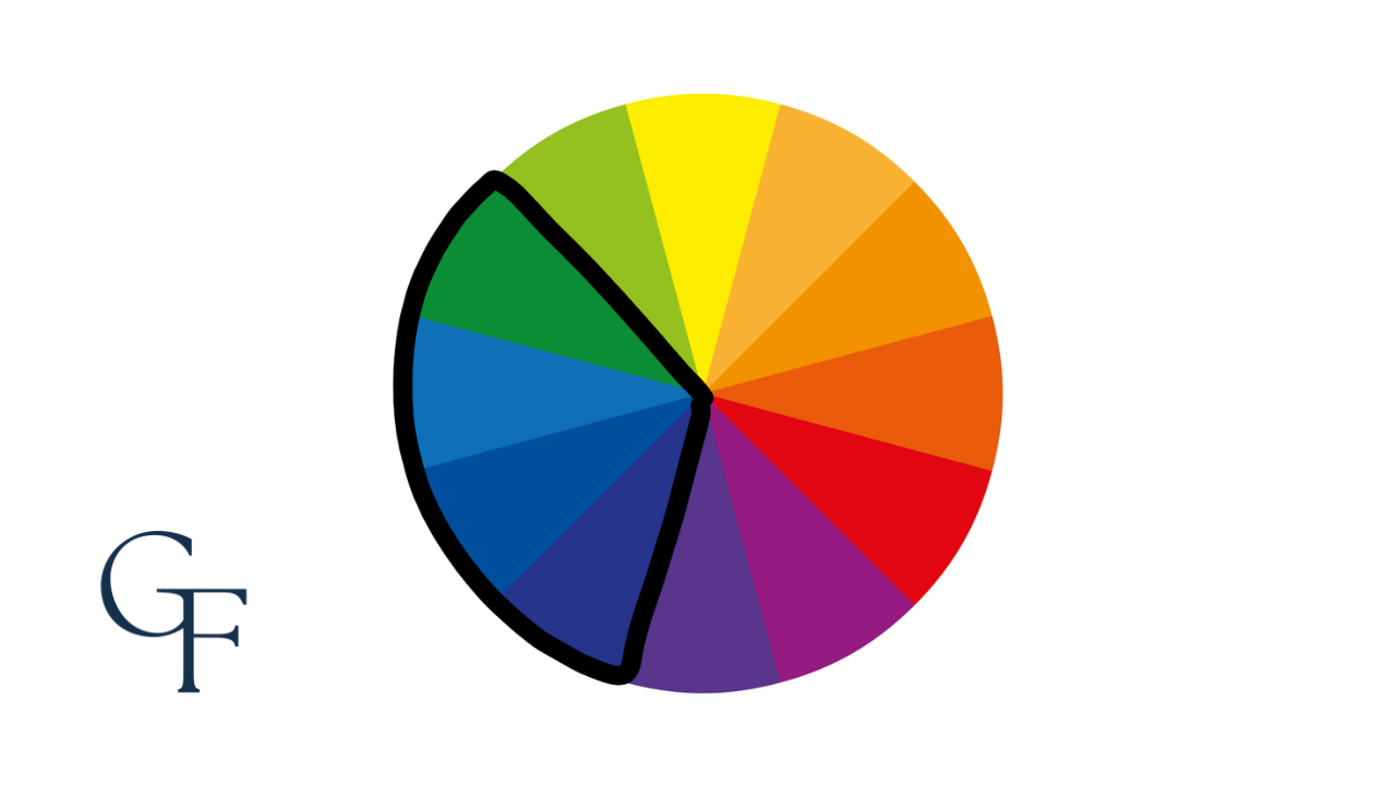
One of the most attractive palettes is the analogous color combination, which consists of two to four adjacent colors on the color wheel.
Consider Your Complexion
The Power of Neutral Colors
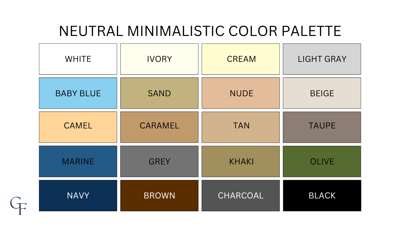
I firmly believe that neutral colors are a safe bet for any man, regardless of skin tone. However, this does not change the fact that wearing the right colors to complement your complexion can be a powerful way to enhance your overall look.
Warm vs. Cool Skin Tone
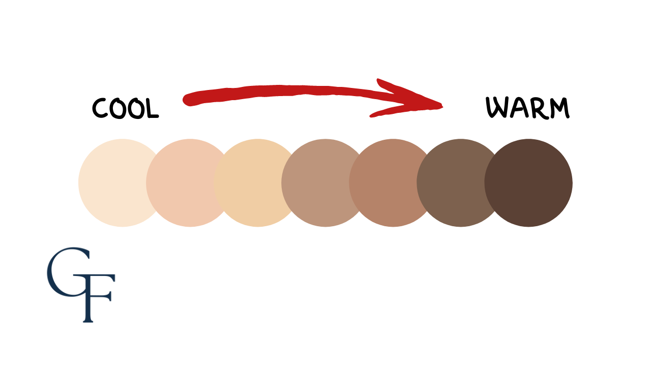
The ultimate objective of wearing the right colors for your skin tone is to draw a person's gaze towards your face. Therefore, the complexion of your skin is vital to consider.
For example, if you have what's considered to be an olive skin tone, then this would mean that you have a warm complexion; thus, warm colors are often best for you. Conversely, if you have pale skin with hues of pink and blue in your veins, you have a cool complexion; thus, wearing cooler colors would be your best bet.
Levels of Contrast

Skin tone can also influence a person's natural contrast. For instance, an individual with fair skin and light hair is generally considered to have lower contrast, whereas someone with dark hair and pale skin is considered to have higher contrast.
The confusion arises when considering men with both dark skin and dark hair. It may seem that this combination would make them low-contrast individuals. However, men with very dark skin should be considered high-contrast individuals because of the striking whiteness of their teeth and eyes. For men with higher contrast, combinations such as black and white can look exceptionally handsome.
Applying the Fashion Color Wheel to Your Wardrobe
The color wheel is a useful tool for selecting color combinations that complement each other in clothing. Understanding the color wheel can assist in creating stylish outfits. The fundamental principle of color matching is to combine colors that work well together in harmony.
Complementary colors, such as red and green, violet and yellow, and blue and orange, work best when combined. Analogous color matching involves matching two or three continuous shades on the color wheel that blend well. Monochromatic color schemes involve using different shades of the same color to create a cohesive look.
Analogous Outfits

I love blue and green. These are analogous colors, meaning they sit next to each other on the color wheel and pair well with other neutrals, such as tan, khaki, or white. Whether it's a jacket, whole footwear, or simply the sole of your shoes, nearly every combination of these colors looks intelligent and elegant.
Complementary Outfits
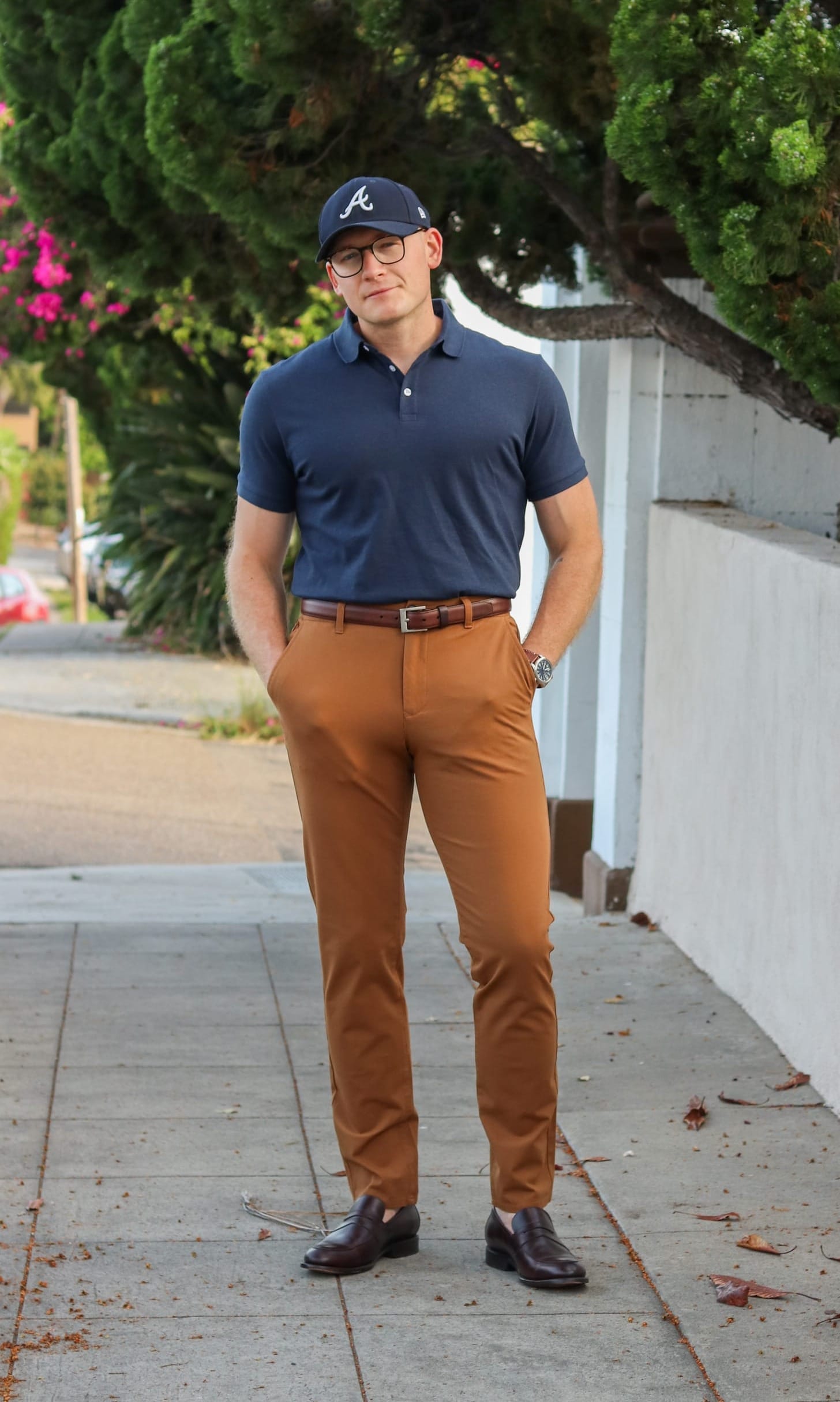
Here, I'm wearing a navy blue polo shirt and warm camel chinos. Blue and brown always go great together; in a neutral-colored wardrobe, you can easily (and safely) pair the two together. These camel chinos have hues of orange. Blue and orange are complementary colors, which means they sit opposite each other on the color wheel.
I chose coffee-brown loafers and a matching belt to complete this casual look.
Monochromatic Outfits

Here, I am experimenting with a monochromatic outfit, which consists of different shades of the same color. In this case, I combined black and charcoal grey to achieve a simple yet striking look. The only item that breaks the monochromatic pattern is my boots.
Let me take a moment to give a shout-out to dark olive suede boots. I believe these boots are incredibly versatile and can often substitute for both brown and black boots. For this outfit, I paired a charcoal herringbone car coat with a black long-sleeve crewneck shirt, black jeans, and a charcoal scarf. While it may not be particularly noteworthy, the olive suede chukkas add a subtle touch of depth and visual interest to an otherwise simple (mostly monochromatic) look.
Of course, black and gray are technically not colors, as we established earlier in this post. So, if you want more color, I would suggest a look like this one, where I am wearing various shades of blue. The outfit below is a more casual example of a mostly monochromatic ensemble that works well for the spring or autumn months, featuring a classic Harrington jacket.

Nailing Stylish Color Combinations
Understanding the color wheel can help you create a cohesive and stylish wardrobe. Take the time to experiment with different color combinations and find what works best for you.
Equipped with the knowledge of the color wheel, you’ll be able to look and feel your best every day throughout the year.
Continuous learning and growth can help you develop your personal style and confidence. Hopefully, using this ultimate color wheel guide can help you create perfect color combinations and find the best colors for you.

