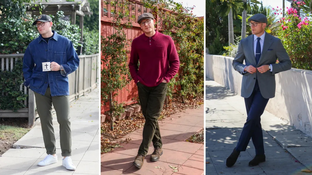
One of the most significant aspects of what we wear as men is the color combinations of our outfits and how each piece interacts. Unlike the fit of our clothes (the number one most critical style component), understanding colors is much more nuanced. This article is designed to walk you through the basics of understanding the importance of color theory related to style.
Consider this article the "crawl" phase (we will worry about walking and running in the future). When wrapping our heads around the subject of colors, it all starts with the fundamental color wheel.
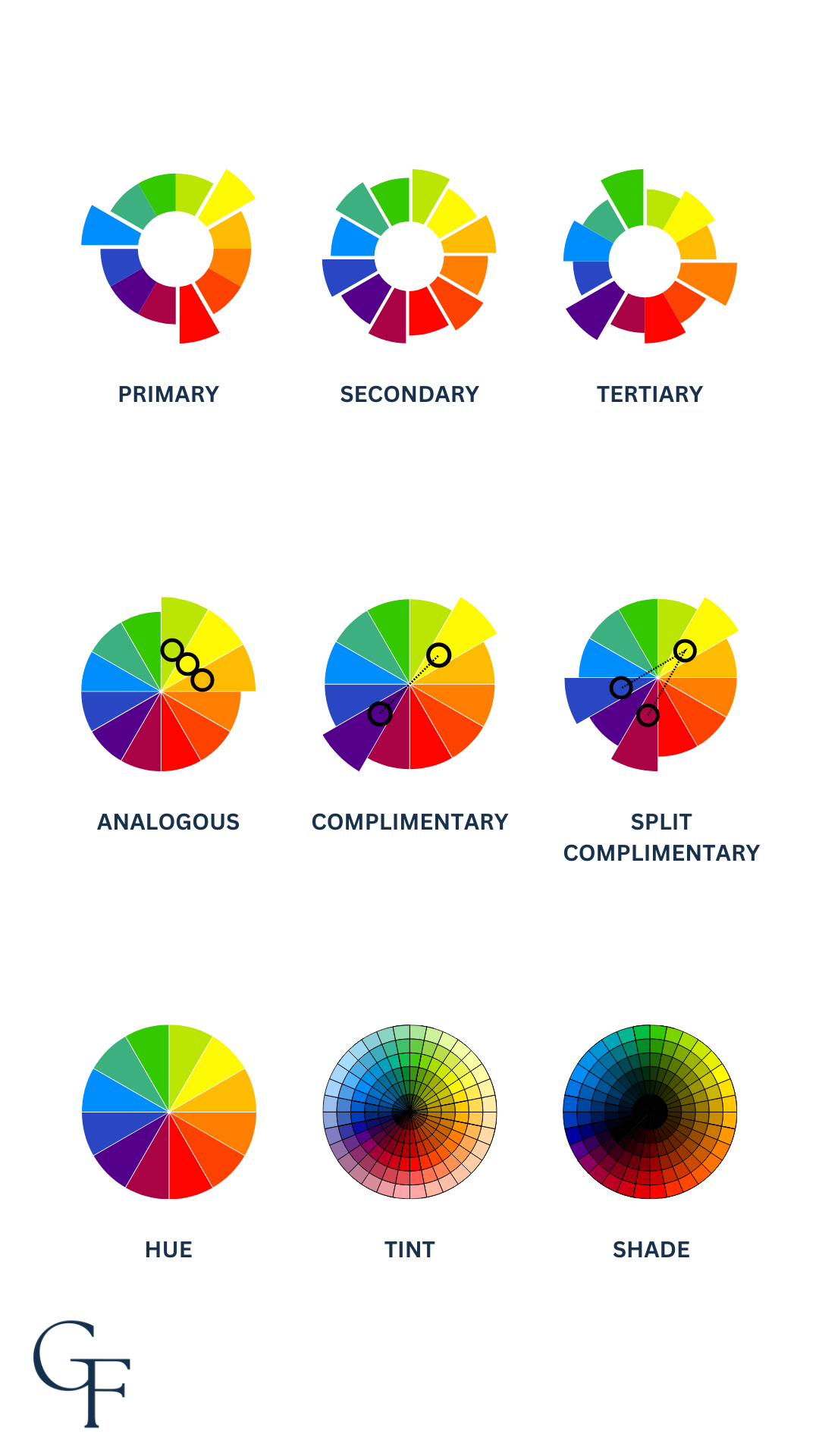
Behold the Color Wheel
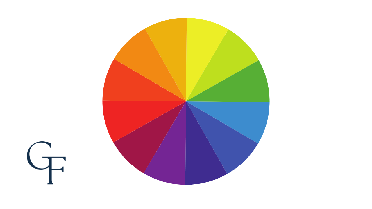
This tool was devised in the 17th century by Sir Isaac Newton. Initially developed for science and studying the refraction of light beams, the orientation of this wheel has since found its way as a mainstay in design, art, and fashion.
Let's begin by breaking down the various portions of the wheel itself.
Primary Colors
Primary colors are considered the basis from which all other colors originate. All additional colors that we know of are mixed from primary colors, and as you might expect, this also means that we cannot mix any other colors to form any of the three primary colors.
Secondary Colors
Secondary colors are formed by mixing two primary colors. So, for example, yellow and blue combine to create green. On the color wheel, secondary colors lie between the primary colors.
Tertiary Colors
Tertiary colors fill in the rest of the wheel and are created by mixing primary and secondary colors. This is where we get all those lovely colors that resemble primary and secondary colors but are not in and of themselves primary or secondary. For example, red combined with purple makes magenta.
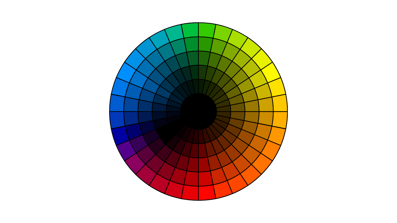
We have showcased the color wheel as having twelve distinct colors until now. It is important to note that this oversimplifies all possible colors we can make. In reality, the wheel looks more like this:
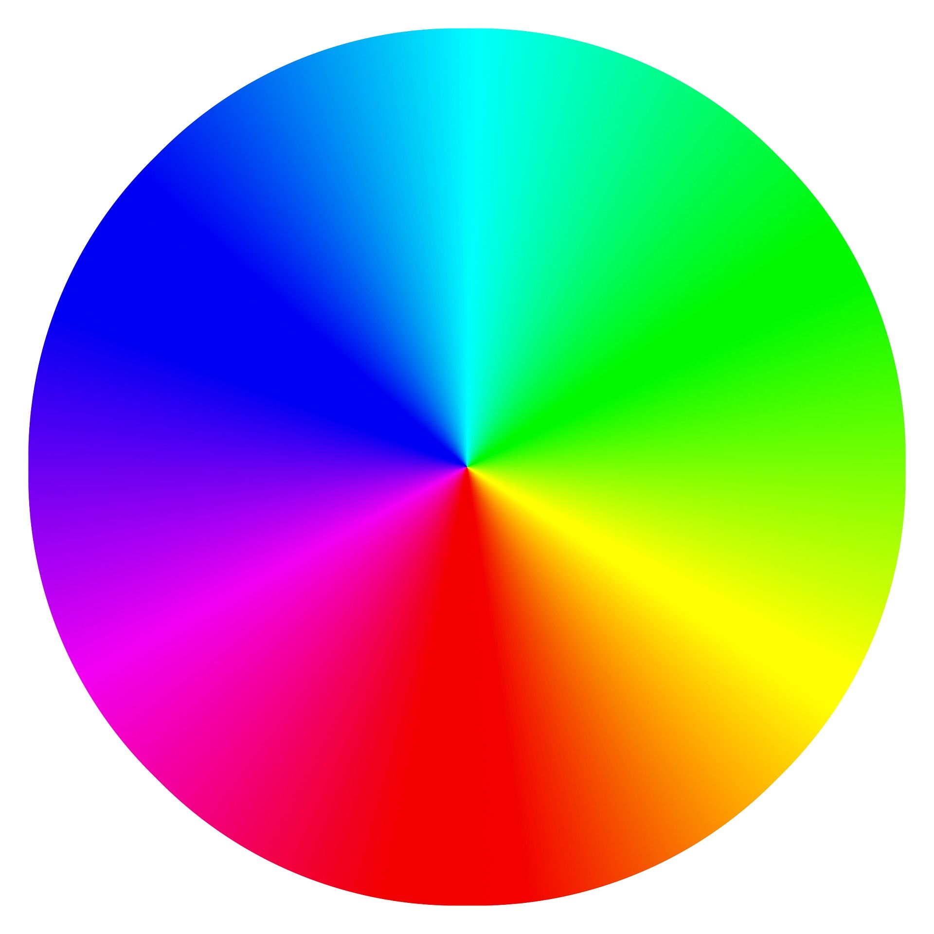
Yes, it's a lot.
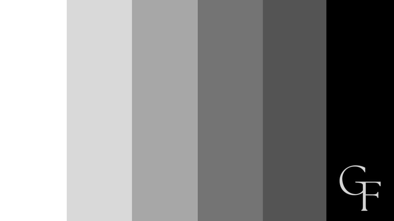
What About Black & White?
You probably noticed that black and white are not a part of the color wheel, and this is because the two are not technically colors. Instead, they exist on a different scale called the grayscale because many shades and tints can be created by mixing various quantities of black and white (more on this later).
Important Terminology
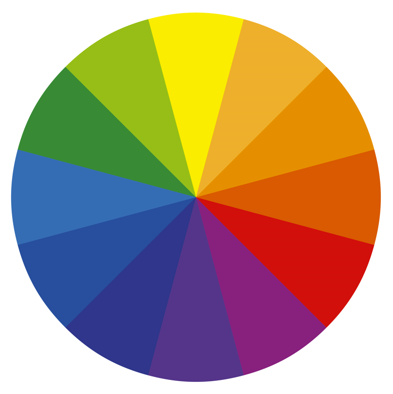
Sticking with our twelve colors on the color wheel, let's cover a few more terms that are pretty important to understand.
Hue
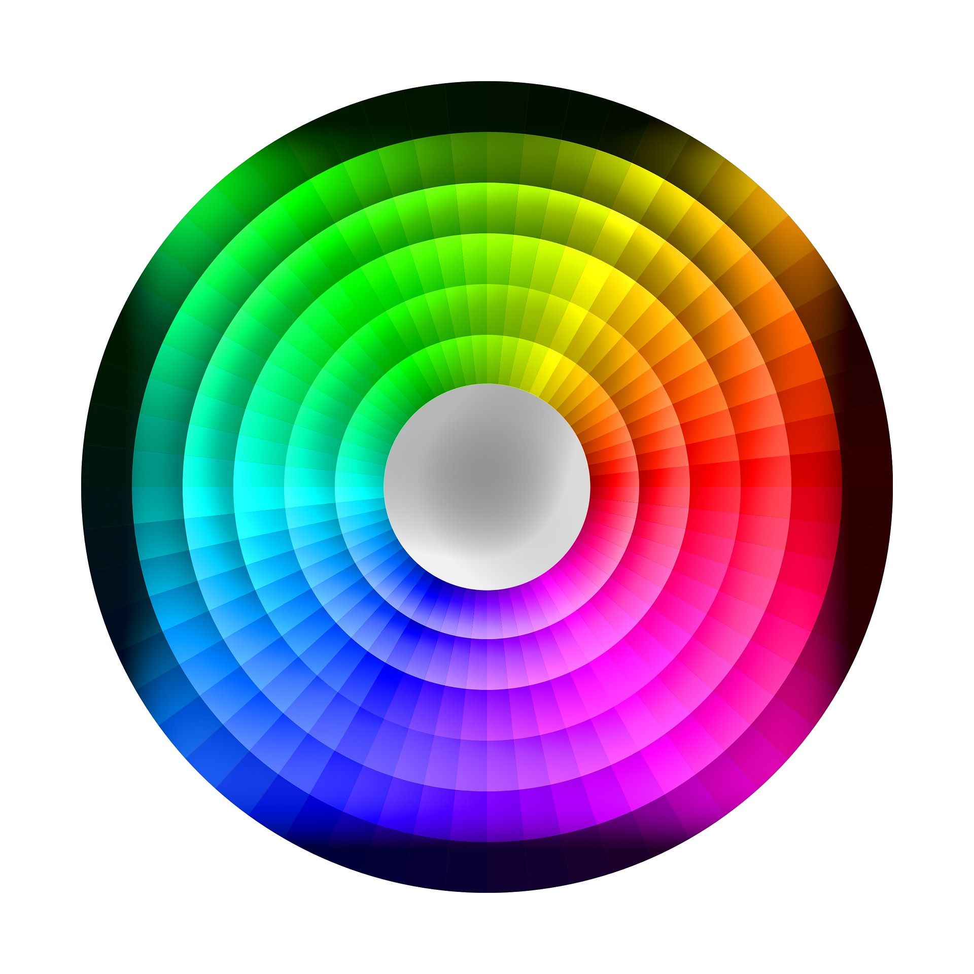
Hue can be a lot more confusing than it is; it is just color in and of itself. For example, we see twelve hues in our standard twelve-color wheel (depicted below).
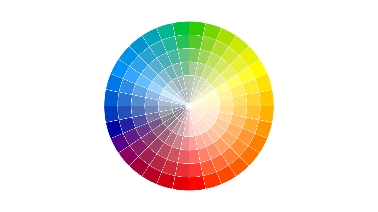
And even if we were to look at the more complex version of this same wheel (shown below) and pick a random, single color from it, whatever that color is would also be its hue.

Don't overthink it; hue is whatever single color exists on our color wheel spectrum. For example, the hue of the color blue is just blue; the hue of the color magenta is just magenta.
Value (a. k. a. Tint & Shade)
When white is added to any color, it becomes a tint of that color, resulting in a less intense and lighter hue.
By the same token, if we add black to any color, we produce a shade of that color, resulting in a darker and less intense hue.
This relative lightness and darkness are referred to as a color's value.
Shade (Left) & Tint (Right)
Saturation
We mentioned intensity before; tints, shades, and tones are less intense than their proper color hues. Again, hues are referred to as "true colors" on the color wheel, and black, white, and gray do not reside on the wheel at all; therefore, they must be added separately to make tints, shades, and tones.
This general intensity level is known as a color's saturation. If the color is dull and grayed out, then it is desaturated. Conversely, it is more saturated if the color is brighter.

Temperature
Color temperature refers to its apparent warmth. Looking back at our three primary colors, red and yellow are considered warm colors, whereas blue is regarded as a cool color. Each color's respective warmth changes as we move around the color wheel.
For example, a warmer red would exhibit more yellow, while a cooler red would exhibit more blue (see below):
Warmer Red on the left versus Cooler Red on the right.
The results can vary when we mix warm and cool colors. For example, green is considered a cool color (a combination of blue and yellow), while purple is regarded as a warm color (a combination of red and blue).
What's important is that, much like the above examples, all colors can be warmer or cooler depending on how much red, yellow, or blue they contain.
Even More Possibilities
When we combine hue, value, saturation, and temperature, the results are numerous possible color combinations concerning our standard twelve-color wheel. The result looks something like this:
Palette Creations
Okay, so we've introduced the color wheel and explained how it serves as a tool for dressing well. With all that out of the way, let's showcase how we utilize this tool to create color combinations that work well together. To do this, we will need to introduce a few more terms, but they all make sense concerning the wheel itself.
Monochromatic
This straightforward palette option takes a single color from the wheel and applies tints, shades, and tones to create different possibilities.
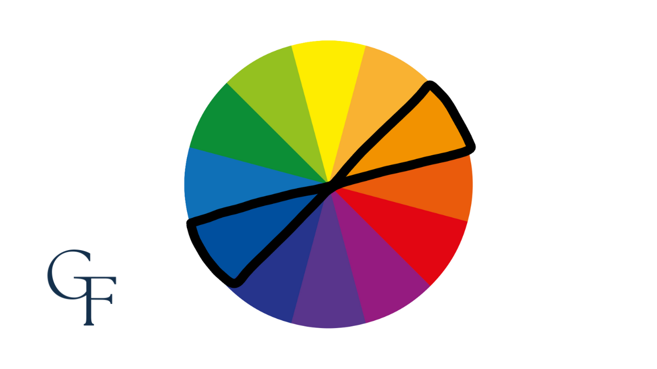
Complementary
Complementary colors sit directly across from one another on the color wheel and feature the most contrast due to their distance away from one another. These colors look great when paired together and work well to provide balance when assembling different outfits.
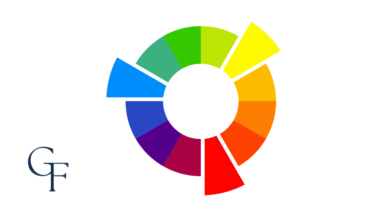
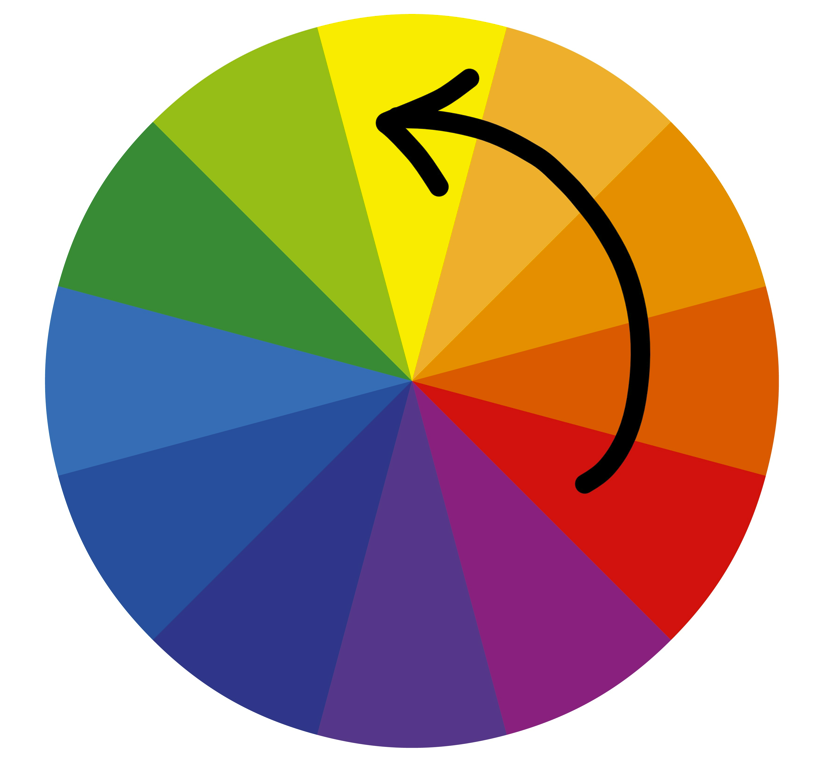
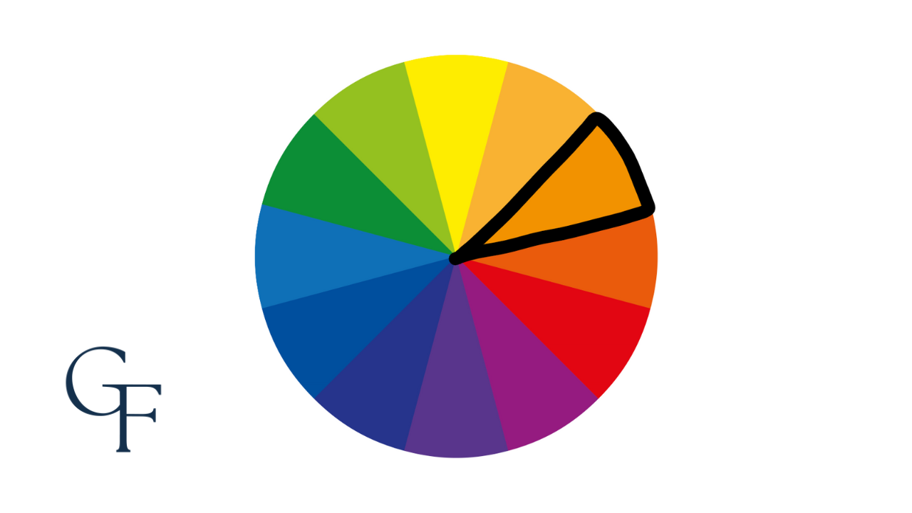
Split-Complementry
Similar to complementary colors, this palette starts with a single color from the wheel and its two direct correlative colors of that single color's complement. For example, red-orange and yellow-orange are the split complementaries of the primary color blue (see below).
Split-complementary colors allow for the same contrast level as complementary colors but provide more variety.
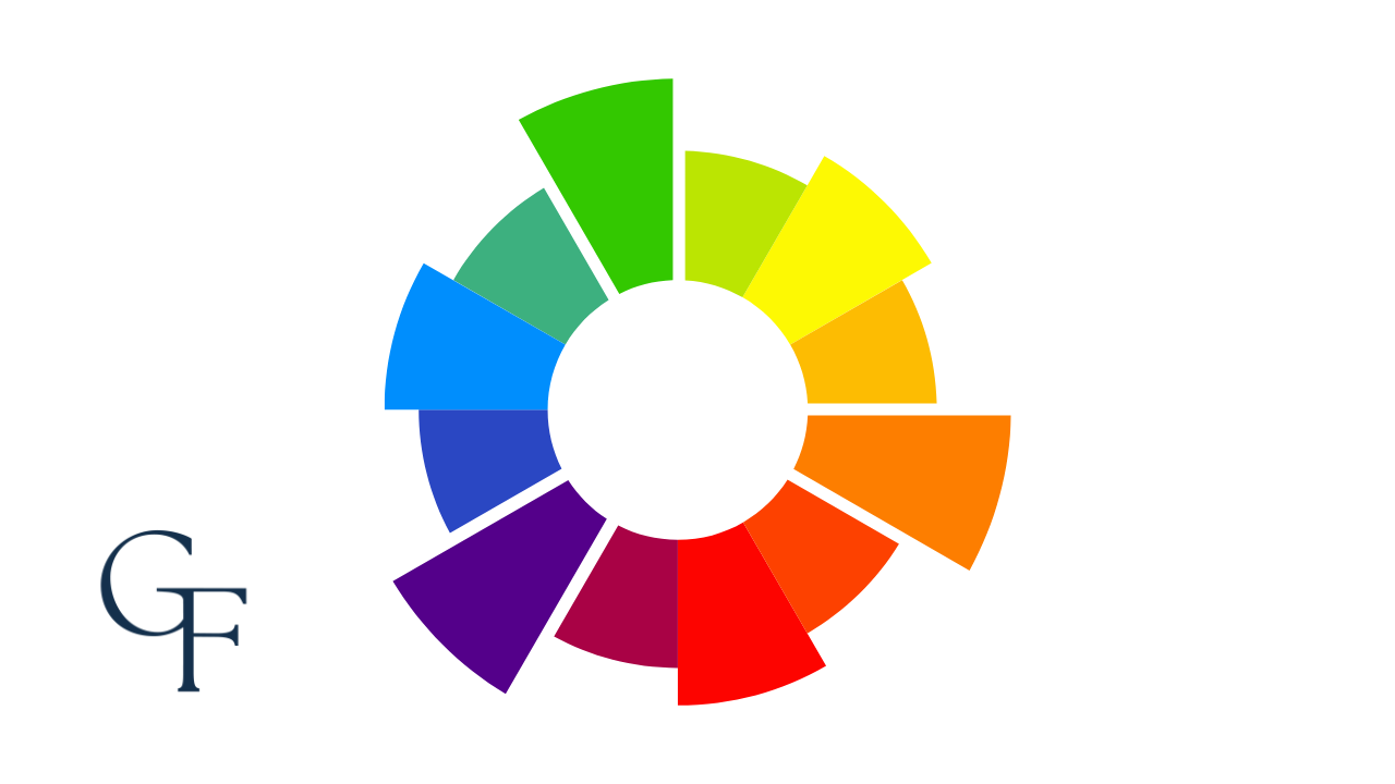
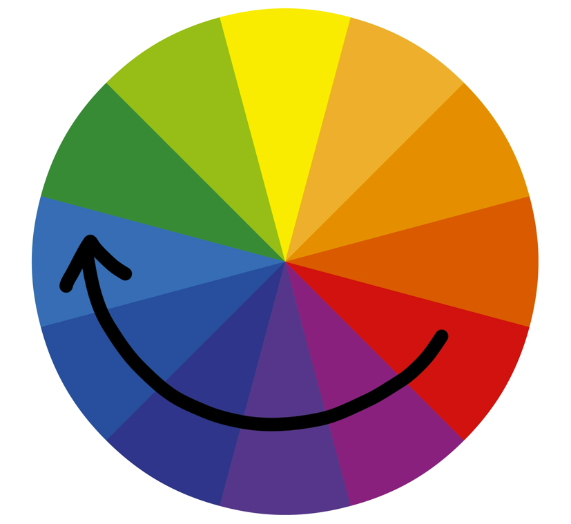
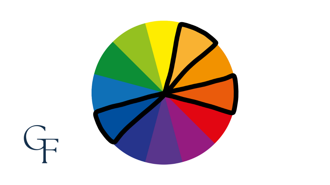
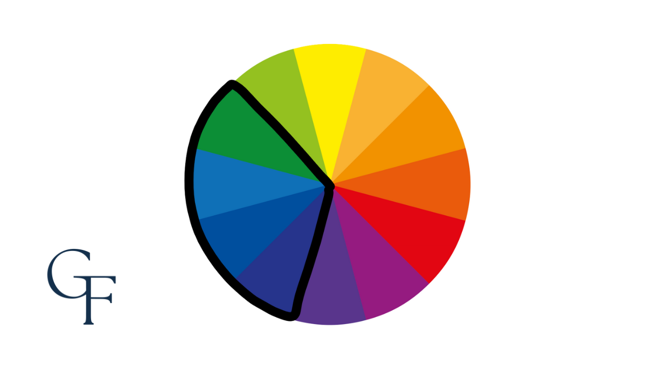
Analogous
One of the more handsome palettes is the analogous color combination: two to four colors on the wheel which sit next to each other.
Closing
This information is only the beginning. The concept of color becomes increasingly important when we talk about dressing for our skin tone and the relationship between colors and different patterns.
Hopefully, after reading this post, you are better armed with the knowledge of which colors to wear and pair together.